5 (Non-Boring) Ways to Style Neutrals in Your Home
Design by: Anna Karlin Studio
It’s no secret, neutral colors and textures have become more popular than ever.
Homeowners switched their bright-colored couches for neutral ones, renovated their kitchens from cherry + granite to white and marble, and stripped their wall-papered spaces to reveal walls that they could paint a soft beige.
But while neutrals can do a great job of serving a space, they can also be super intimidating. When we’re designing our own client’s homes we have to be careful to make sure we’re incorporating other elements so that space doesn’t feel flat.
So, how do you style neutrals in your home correctly?
Today, we’re going to be answering your questions and discussing the best ways we style neutrals. With these tips, you’ll be able to create a neutral home that doesn’t feel boring, and looks elevated, cohesive, and beautiful.
5 (Non-Boring) Ways to Style Neutrals in Your Home
Incorporate Texture
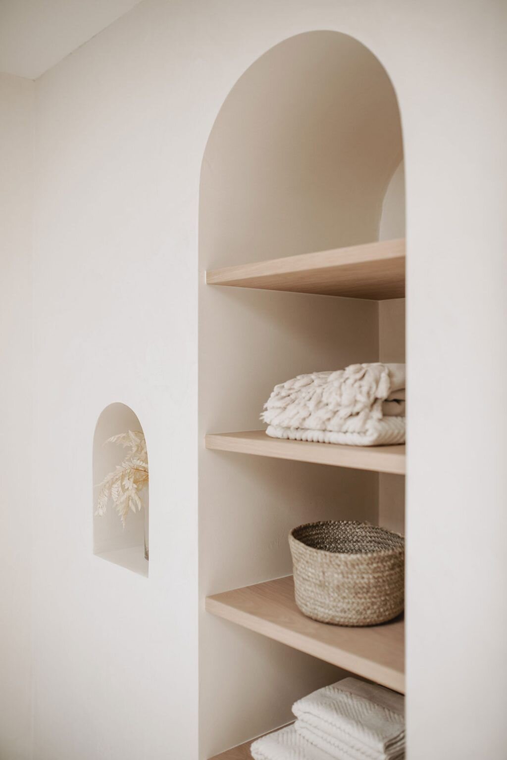
When it comes to styling a neutral space, texture is our best friend. We use texture to add interest and a different dynamic into our client’s space which keeps it from feeling dull. When you’re looking for neutral pieces for your home, try to incorporate items that have a lot of texture to help break up the monotony of the tones - like a white boucle accent chair or white oak dresser with lined grooves. You can also find textures in textiles such as linen pillows, handwoven rugs, or sheepskin throws.
One thing to keep in mind is that different types of textures can give off different feelings. If you are looking for your space to feel a bit more relaxed, you can incorporate linen fabrics to create a more laid-back feel. Or if you’d like something more luxe, then look for textures in velvet or satin.
Texture can also be achieved through vintage elements like ceramics and vases. Try different options and see which texture you’re drawn to the most, then incorporate a bit of each to keep your space feeling nice and balanced.
Stick to warm tones
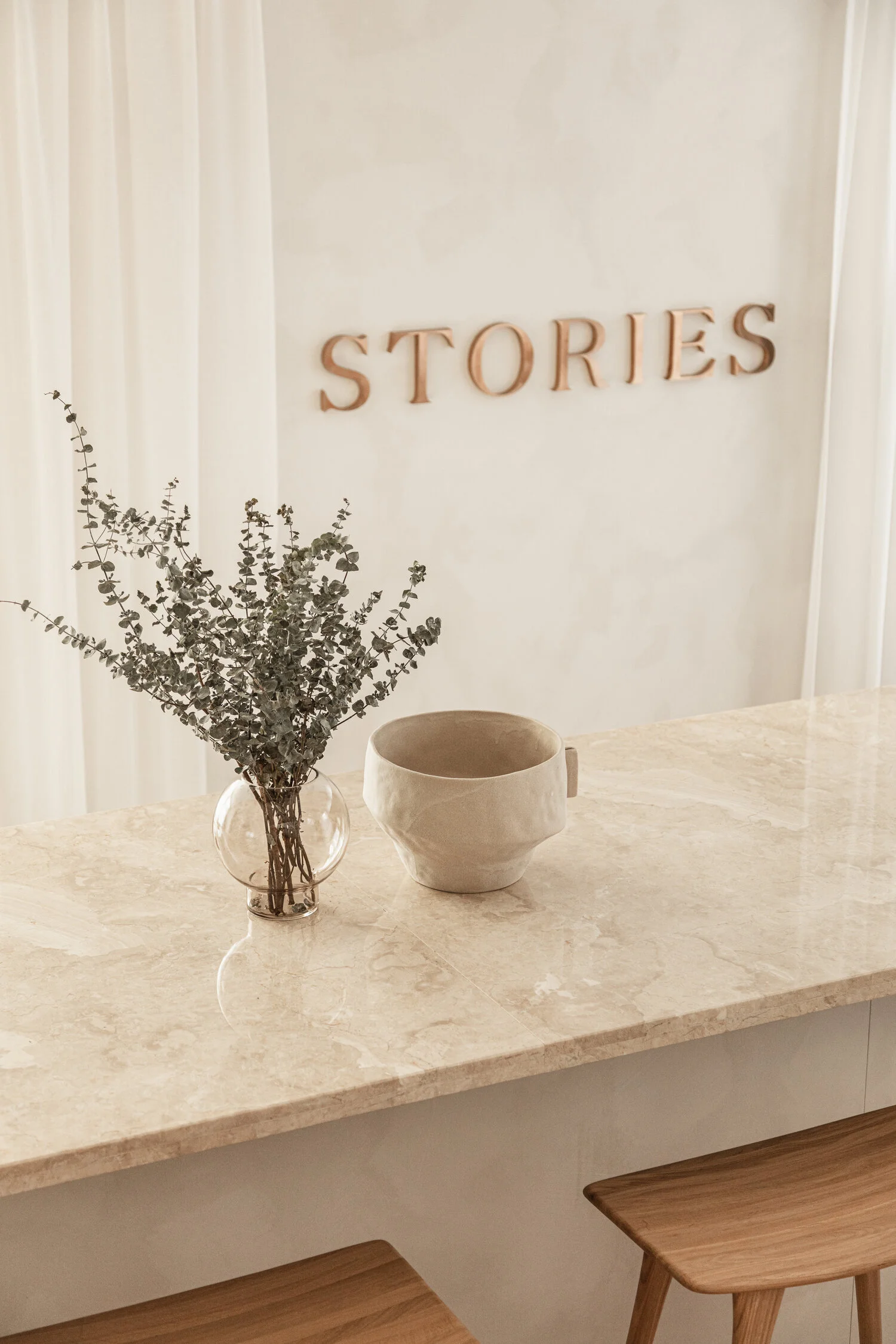
Another important way that we style neutrals is by sticking with the warmer tones. We’ve learned that this can help the space feel more friendly and inviting (and not like a hospital asylum). It also allows for easier blending and cohesiveness within the space, since the undertones are already on the warmer side. This could be switching your pure white vase for an ivory one, sticking to beiges and tans over silver and grays, or deciding to paint your space a warm white vs a cool one. Here are a few paint recommendations of our favorite warm whites that are interior designer-approved:
Clare Paint - Whipped (warm with soft, delicate feel; perfect for North-facing windows that don’t get tons of light but versatile enough for other rooms as well)
Benjamin Moore - White Dove (this warm white is the perfect complement for a warm, modern space that will especially enhance wood tones and pastels)
Benjamin Moore - Simply White (this white leans warm, but is bright and welcoming)
Sherwin-Williams - Pure White (true, elegant white that’s great for the trim of your house)
Make sure before painting you do a test swatch in your own space! Let it sit for a couple of days and pay attention to the color at different times of the day.
Add contrast
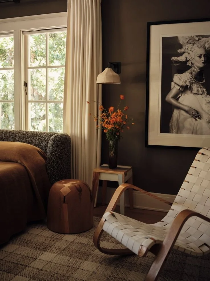
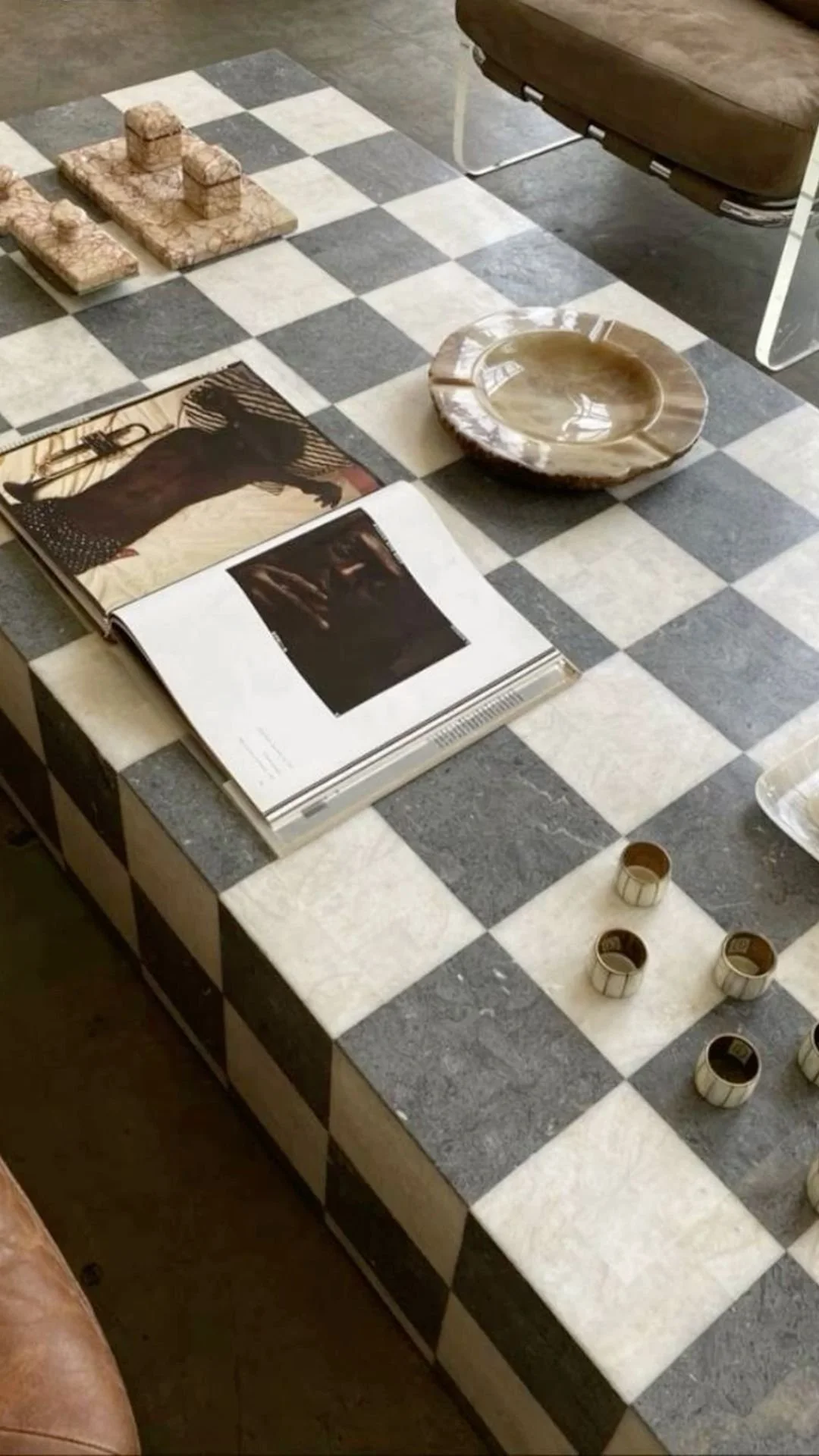
Despite popular belief, another great tip we use to keep our neutral space from feeling too flat is by introducing dark colors through out this space. This brings contrast and depth into the home and makes the neutral tones feel more balanced.
The next time you’re styling your neutrals, add elements of black, dark brown, and even deep navy through your home decor, artwork and accent pieces. You can also bring that same contrast in with the fixtures of your home (doorknobs, cabinet handles, etc.).
If you’re intimidated by deep black in your decor, you can go for an aged black instead (like a ceramic vase), these normal have a softer and more vintage look. Whatever contrast you decide to add is your choice, but make sure you use it sparingly or it may start to overpower the rest of your home.
Natural Elements
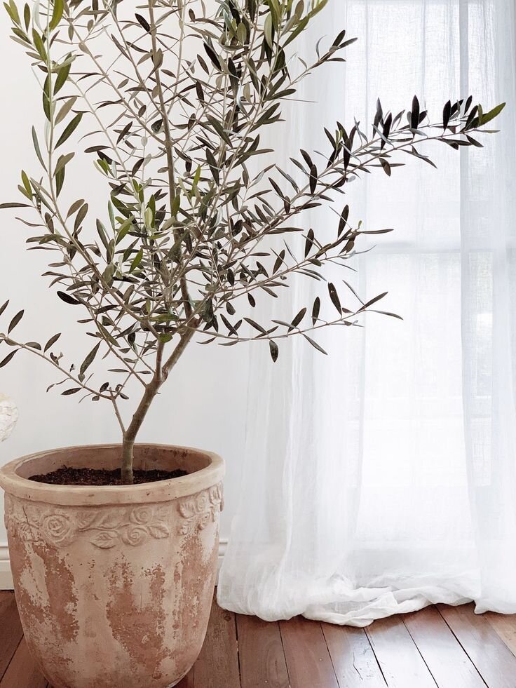
We love bringing the outside in when we’re designing our client’s homes — and for a good reason! Natural and organic elements like plants, wood, jute, cane, rattan, and earth tones help break up the monotony of the neutral tones while still keeping the space feeling cohesive.
Try adding a jute rug or cane furniture to help create depth and interest in your space! It really does wonders and adds texture and balance in your home.
Plants also do a great job of bringing life to a space and breaking up the monotony of neutral tone. Make sure to incorporate those as well if you’re looking for your home to feel warm and inviting!
Layers
The last way we style neutrals in your home is by adding layers! Layers do a great job of adding depth and allow you to use the same tones without it feeling too boring.
Try layering your neutral vintage rug on top of a large jute rug. Or throwing an ivory blanket on top of your light taupe sofa. We’ve learned that layers help create a soft contrast that adds depth and creates a cozy and inviting space — while still keeping it neutral and cohesive.
We hope these tips helped when trying to achieve a beautiful and neutral home. Which one is your favorite? Let us know in the comments below!
CQ Interiors is a virtual interior design studio for new homeowners and renters. Bringing warm, relaxed and contemporary design to interiors, we craft dream spaces for our clients that inspire and restore the soul. Want to work together? Shoot us an inquiry here.








This week's mood: marble drama, moody bathrooms, and brass that'll make you swoon